臺南國際音樂節 | Tainan International Music Festival
-
-
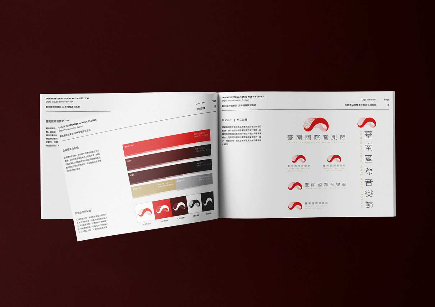
臺南國際音樂節品牌識別設計以臺南的古地名「鯤鯓」融合並導入音樂的核心主軸,聲音轉化成韻律流動的視覺符號,透過蜿蜒的線條交會詮釋音樂演奏時的美妙,並隱喻了鯨魚躍出水面的動作,回歸在地性的文化象徵,表現圓融的高度包容性,喚醒屬於臺南的音樂價值。輔助圖形強調「樂性」導入為核心,設計上使用漸變線條的手法表現音樂的渲染力,結合俯視的波浪元素,透過不同圓弧的切割,相互交錯下使視覺上充滿聲波的韻律感,並內斂的隱藏了鯨魚的輪廓於其中,延續在地品牌的核心價值,奠定屬於臺南國際音樂節獨一無二的品牌特色。
The brand design of Tainan international music festival is inspired by “Kūn shēn”(the ancient place name of Tainan City that indicates “whale”), along with the visual symbol of music sound flow. The curvy line intersections interpret the beauty of music; and it also implies the motion of whale breaching as the local cultural symbol for the inclusiveness and diversity of Tainan City. The supporting pattern emphasize the "music" as the core using gradual lines to express the power of music. Combining the wave elements with the cutting of different arcs, making the visual full of the sound waves rhythm. The concealed whale silhouette continues the core value of the local brand, and establishes the unique brand characteristics of the Tainan International Music Festival.
Art Director - Midnight Design
Design - I Chan Su、Hsuan Yu Hsu
Client - Tainan City Government
Design - I Chan Su、Hsuan Yu Hsu
Client - Tainan City Government